Taco Bell Global Web Navigation
Redesigning Taco Bell's Navigation for a Seamless Experiencce
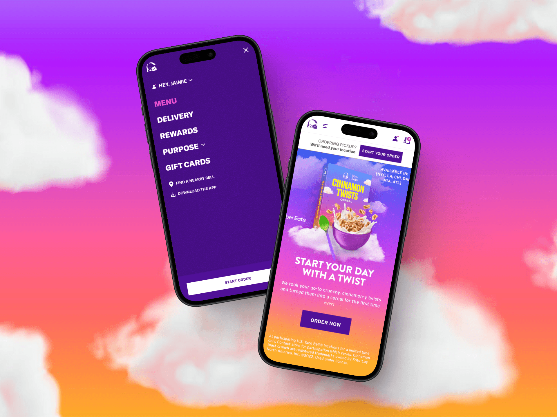
Taco Bell’s website navigation had been unchanged for nearly two decades, making it difficult for users to navigate efficiently. The goal was to modernize the navigation system, eliminate redundancies, and enhance the overall user experience by showcasing Taco Bell’s brand and innovative features.
Working within a Scrum team, I collaborated closely with a product manager, data analyst, developers, and content strategists to ensure feasibility, data-driven decisions, and brand alignment. My role was to design a responsive global navigation system that would scale smoothly between mobile and desktop views while staying true to Taco Bell's vibrant, bold brand. This wasn’t just about visual design—it was about crafting an intuitive, seamless experience that worked everywhere.
Discovery & Strategy
To kick things off, I worked with the research and analytics teams to gather data, establish benchmarks (which would help inform the wireframes) and prepare an A/B test of both legacy and new designs. The insights were clear: loyalty users converted 6x more than guests, creating a huge opportunity to push sign-ups through better navigation!
Key Insights:
• Mobile-first priority: With 99% of web revenue coming from mobile, the mobile conversion rate was 20.1%, compared to just 5.7% on desktop.
• Loyalty sign-ups = revenue: Loyal users made up 87% of mobile revenue, while desktop users were 98% guests.
Competitor Analysis
I dove into a competitive audit of QSR brands to see what was working (and what wasn’t) in their navigation systems. Here’s what I found:
•Slide-out menus and simplified designs were the go-to for many competitors.
•Lots of brands used dropdowns to declutter their menus.
•Sign-ups were promoted, but rewards programs weren’t highlighted enough—this was Taco Bell’s chance to shine! 🌟 🌮
•Many competitors had cluttered footers, whereas Taco Bell’s needed a refresh to match its bold branding.
These insights shaped our strategy, and we focused on a streamlined navigation that not only showcased rewards but also made it easier for users to find their favorite menu items.
Wireframing & UX Design
I began wireframing with an emphasis on clarity, ease, and flow. The redesigned structure was more intuitive, eliminated redundant links, and introduced a top navigation bar across both mobile and desktop.
Key Decisions:
• Simplified UI: Removed unnecessary elements and restructured the menu for a cleaner look.
• Mobile-first approach: Focused on mobile-specific interactions that make navigation smoother on smaller screens.
• Rewards visibility – Introduced a dedicated "Rewards" tab in the menu and added a QR code in the footer for easy app downloads. The QR code was paired with an incentive-driven message, emphasizing app-exclusive rewards.
• Design polish & micro-interactions – Updated icons, refined hover states, and added motion elements to create a more engaging experience.
• Accessibility & compliance – Ensured color contrast and text hierarchy met WCAG standards.
Development & Implementation
I partnered closely with developers and our ADA compliance team to ensure the navigation experience was accessible to all users. This included providing detailed spec annotations, collaborating on QA, and continuously iterating post-launch.
Key Actions:
• Developer Collaboration – Supplied redlines, interaction notes, and responsive states for smooth handoff.
• Visual QA – Conducted thorough reviews to ensure pixel-perfect execution across devices.
• ADA Compliance & Accessibility – Worked with accessibility partners to approve color contrast passes and confirm all design updates met WCAG standards. I ensured developers added proper screen reader tags for icons and logos so non-visual users could navigate and understand key brand and feature elements.
• Post-launch Monitoring – Monitored user behavior and gathered feedback for future improvements.
Results
The redesigned global navigation and footer launched in September 2024, driving immediate improvements in user engagement and order flow.
• A +20% increase in shopping flow thanks to navigation improvements.
• Users interacting with the new navigation were 15% more likely to add items to their cart.
• The introduction of “Sign Up” and “Log In” buttons led to a 4% increase in guest sign-ups.
• A 7% rise in users who signed up on the web and later converted to app users.
By simplifying navigation, prioritizing loyalty engagement, and putting Taco Bell’s vibrant branding at the forefront, this project set the stage for ongoing digital improvements.