Crunch Fitness Subscription Test
Optimizing Subscription Payments for Crunch Fitness
As a freelance UX designer, I was hired for a five-month engagement with Crunch Fitness to revamp their subscription/payment flow. The existing process was confusing, especially when users tried to navigate the different membership plans and payment options. Users struggled to understand the distinctions between credit/debit card payments and linked bank accounts, especially with the associated fees. My goal was to design and execute a usability testing strategy to clarify and simplify the checkout experience.
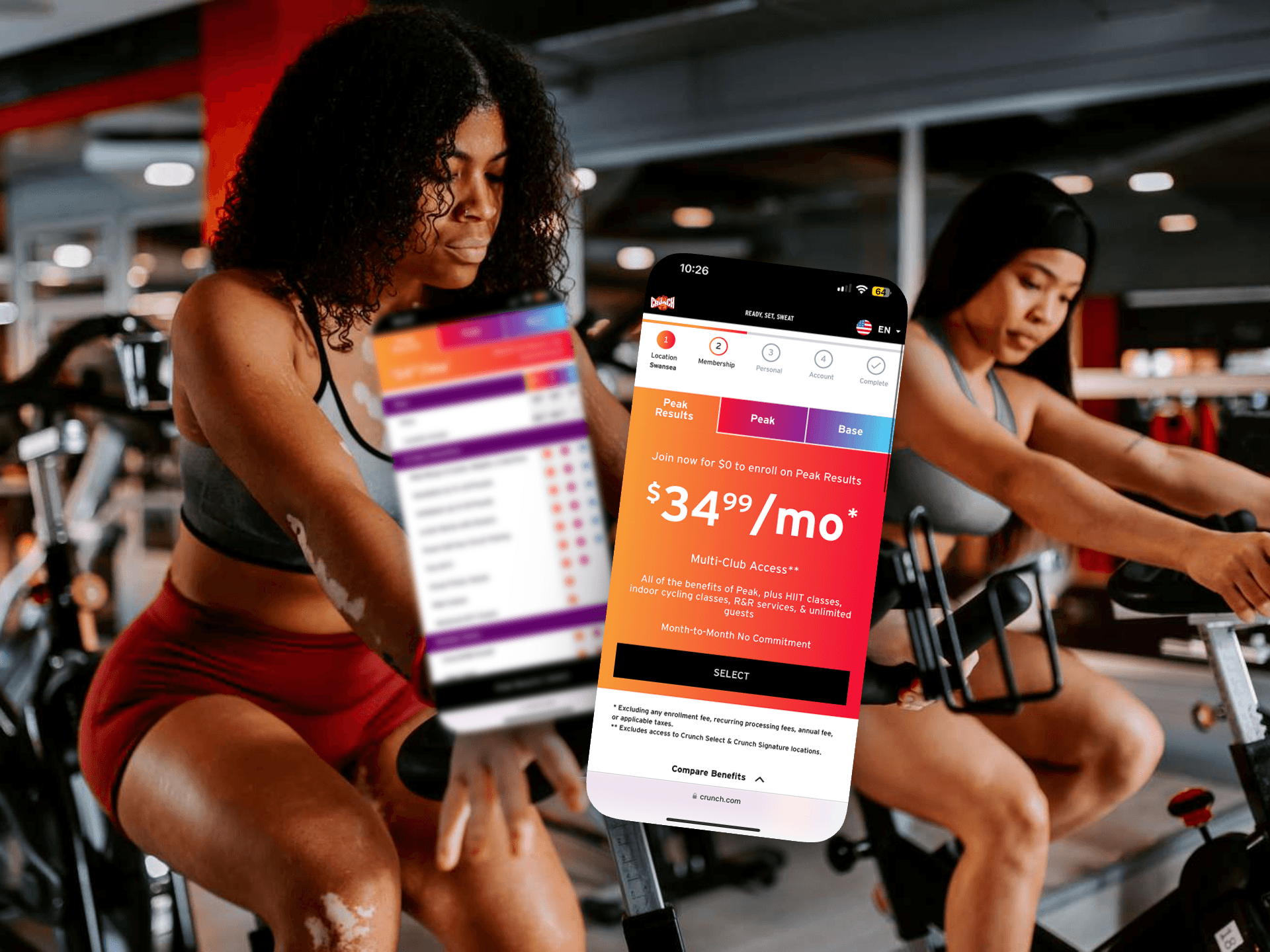
Crunch Fitness offers two membership plans: discounted (linked bank account) and standard (credit/debit card with an added fee), each with three levels. The difference lies in payment type and fees, which confused users. I streamlined the decision-making process and simplified checkout to make it clearer for members.
I collaborated with the account owner, one UI designer, and a strategist to ensure the design aligned with the brand and user needs. My role involved organizing user testing, prototyping, and iterating on user feedback to streamline the subscription and payment process, making it easier for Crunch’s members to navigate their options. 🏋️♂️💳💡
Discovery Phase
To kick things off, I conducted a competitive analysis to see how Crunch Fitness stacked up against its competitors. I examined both direct competitors (like Planet Fitness, 24 Hour Fitness, and OrangeTheory) and indirect competitors (like Netflix and Hulu). The focus was on how subscription plans and payment methods were displayed, with a particular eye on fees.
Key Findings:
•Most fitness sites, like Gold's Gym, used tooltips to clarify additional fees.
•Fitness and subscription services (like Netflix, Hulu) used tabbed or stacked navigation for easy membership comparisons.
This became my blueprint for organizing information in a clearer way!
User Testing Strategy
Armed with insights from the competitive analysis, I crafted a user testing strategy to make sure our tests were relevant to the typical Crunch Fitness user.
Screening Criteria:
•Users who have purchased gym memberships or are familiar with subscription-based services like Netflix or Hulu.
•Focus on users aged 21–45, since 75% of Crunch Fitness users fall into this demographic.
•The tests were split between mobile-first users (based on Crunch’s data showing most sign-ups were on mobile) and desktop users.
Pre-Test Questions:
•How do you usually pay for recurring subscription services? (Credit Card, Debit Card, Linked Bank Account, Other)
•When shopping online, do you prefer to see price comparisons or benefit comparisons?
•How quickly do you expect the price breakdown to appear during an online shopping experience?
These questions set the stage for understanding how users typically interact with subscription models, making it easier to analyze their behavior during the tests.
Prototype & Scenarios
Working with the product manager, I created two versions of the prototype for both mobile and desktop in Figma. These versions incorporated different types of navigation (tabbed vs. stacked) to see which one users preferred.
Test Scenarios:
1. Select the membership plan that’s most suitable for you.
2. Select the membership plan with the most amenities and complete checkout using a credit card.
Test Structure:
•55 users total: 40 mobile, 15 desktop.
•Each test session lasted 20 minutes, including pre/post-test questions.
•The prototype was interactive, guiding users through key decisions, including membership type and payment options.
User Testing Execution
We conducted A/B testing on both the tabbed and stacked navigation systems to answer some key questions:
•Which layout did users prefer for comparing membership types and benefits?
•Would users opt for the discounted plan (despite the friction of linking a bank account), or would they switch to the standard plan (with a credit card fee) for a quicker checkout?
Key Insights & Recommendations
After analyzing 40+ hours of usability testing, we found that users struggled with plan confusion, mobile navigation, and checkout friction. Here’s how we tackled those challenges:
•Plan Confusion: Users preferred having the discounted/standard tab only at checkout to reduce confusion.
Solution: Move payment type distinctions to checkout with clear fee disclaimers upfront.
•Mobile Navigation: Tabbed navigation was more effective than stacked, making membership types easier to compare.
Solution: Implement tabbed navigation for both mobile and desktop to streamline comparisons.
•Payment Preferences: Users favored credit cards over bank accounts due to the friction of linking bank accounts.
Solution: Simplify the bank linking process or offer alternative payment methods to reduce friction.
With these adjustments, we made the subscription flow smoother and more intuitive, reducing confusion and improving overall conversion rates. The revised design not only helped Crunch Fitness users find the right plan for them but also set a clearer path to completing the checkout process with less frustration. 💪